Natural Response
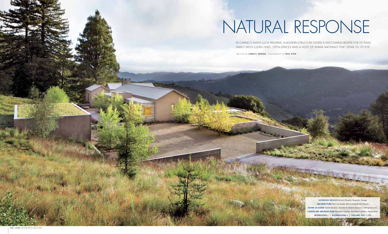
In Carmel’s Santa Lucia Preserve, a modern structure offers a welcoming respite for its Texas family with clean lines, open spaces and a host of warm materials that speak to its site.
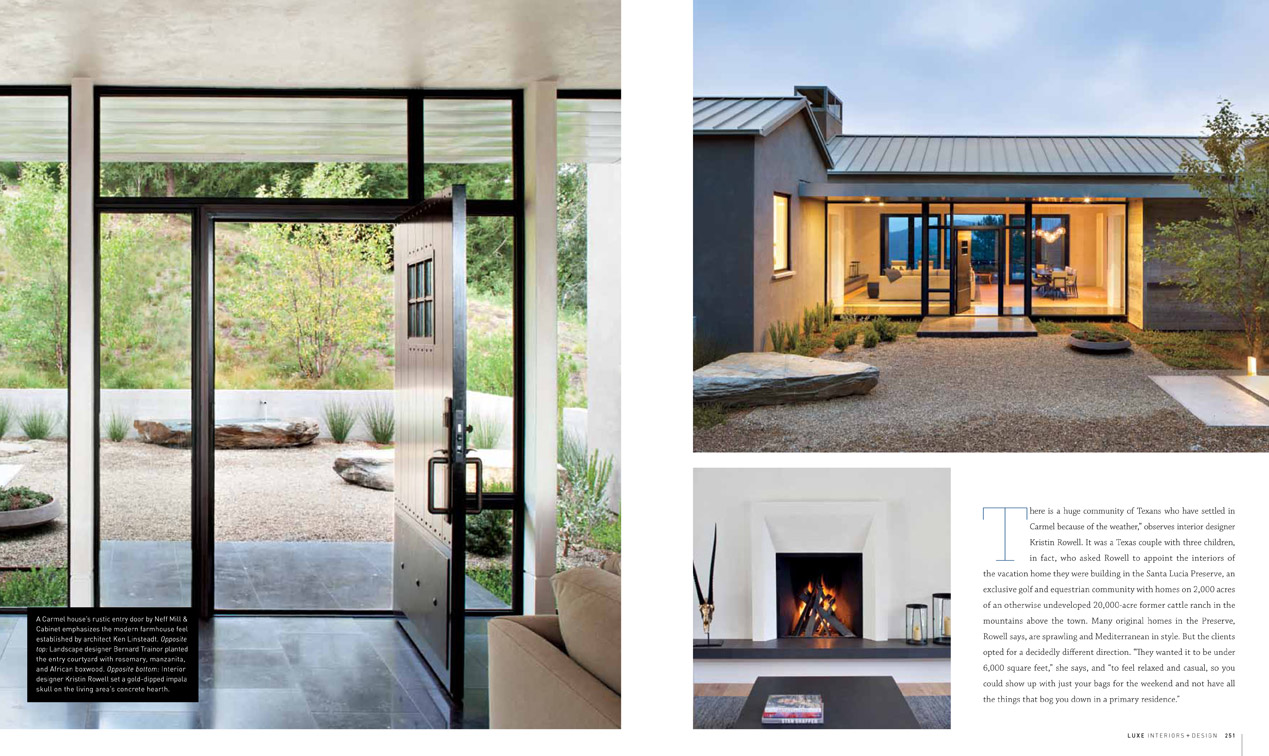
There is a huge community of Texans who have settled in Carmel because of the weather,” observes interior designer Kristin Rowell. It was a Texas couple with three children, in fact, who asked Rowell to appoint the interiors of the vacation home they were building in the Santa Lucia Preserve, an exclusive golf and equestrian community with homes on 2,000 acres of an otherwise undeveloped 20,000-acre former cattle ranch in the mountains above the town. Many original homes in the Preserve, Rowell says, are sprawling and Mediterranean in style. But the clients opted for a decidedly different direction. “They wanted it to be under 6,000 square feet,’ she says, and “to feel relaxed and casual, so you could show up with just your bags for the weekend and not have all the things that bog you down in a primary residence.”
Architect Ken Linsteadt responded to the clients’ directive with a minimalist-modern, farmhouse –style structure he describes as “three gabled pavilions stitched together.” Linked by flat- roofed galleries, the pavilions aptly separate the master bedroom, a study and one central volume with the living-dining area, kitchen and guest suite. To underscore the modern feel, Linsteadt inserted large expanses of windows and crowned the building with a zinc roof. He balanced those elements by keeping the interior “simple and restrained with a warmth of materials.” An although green building wasn’t a specified goal at first, it became “an intuitive part of the design,” says Linsteadt.
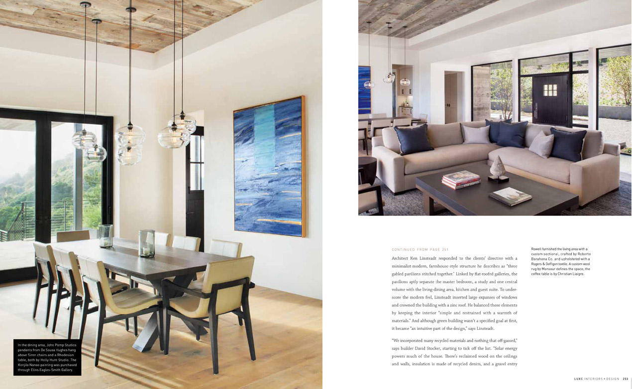
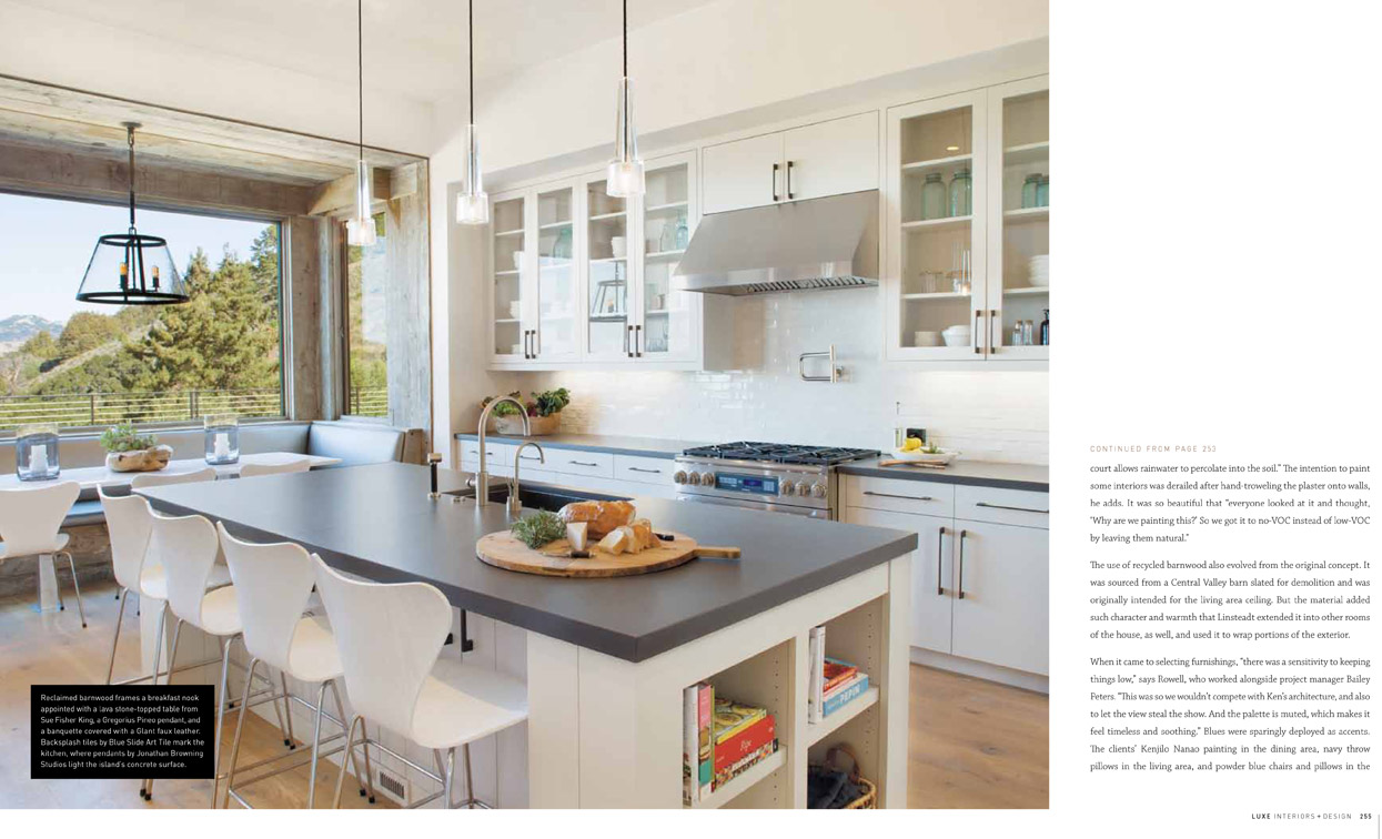
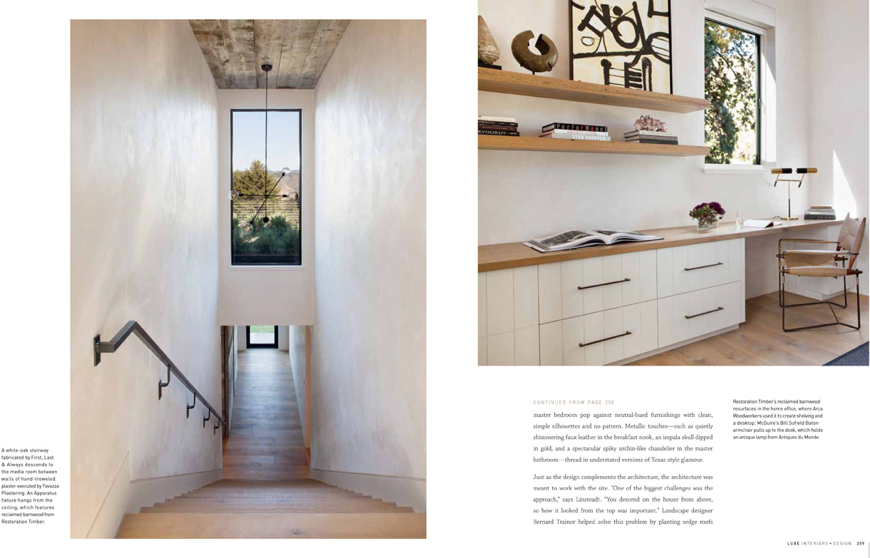
“We incorporated many recycled materials and nothing that off-gassed,” says building David Stocker, starting to tick off the list. “Solar energy powers much of the house. There’s reclaimed wood on the ceilings and walls, insulation is made of recycled denim, and a gravel entry court allows rainwater to percolate into the soil.” The intention to paint some interiors was derailed after hand-troweling the plaster onto walls, he adds. It was so beautiful that “everyone looked at it and thought, ‘Why are we painting this?’ So we got it to no-VOC instead of low-VOC by leaving them natural.”
The use of recycled barnwood also evolved from the original concept. It was sourced from a Central Valley barn slated for demolition and was originally intended for the living area ceiling. But the material added such character and warth that Linsteadt extended it into other rooms of the house, as well, and used it to wrap portions of the exterior.
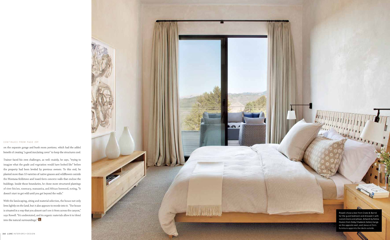
When it came to selecting furnishings, “there was a sensitivity to keeping things low,” says Rowell, who worked alongside project manager Bailey Peters. “This was so we wouldn’t compete with Ken’s architecture, and also to let the view steal the show. And the palette is muted, which makes it feel timeless and soothing.” Blues were sparingly deployed as accents. The clients’ Kenjilo Nanao painting in the dining area, navy throw pillows in the living area, and powder blue chairs and pillows in the master bedroom pop against neutral-hued furnishings with clean, simple silhouettes and no pattern. Metallic touches—such as quietly shimmering faux leather in the breakfast nook, an impala skull dipped in gold, and a spectacular spiky urchin-like chandelier in the master bedroom—thread in understated versions of Texas-style glamour.
Just as the design complements the architecture, the architecture was meant to work with the site. “One of the biggest challenges was the approach,” says Linsteadt. “You descend on the house from above, so how it looked from the top was important.” Landscape designer Bernard Trainor helped solve this problem by planting sedge roofs on the separate garage and bunk room portions, which had the added benefit of creating “a good insulating cover” to keep the structures cool.
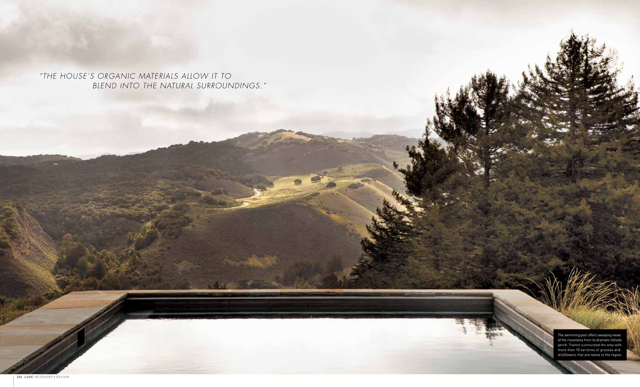
Trainor faced his own challenges, as well: mainly, he says. “trying to imagine what the grade and vegetation would have looked like” before the property had been leveled by previous owners. To this end, he planted more than 10 varieties of native grasses and wildflowers outside the Montana fieldstone and board-form concrete walls that enclose the buildings. Inside those boundaries, he chose more structured plantings of river birch, rosemary, manzanita, and African boxwood, noting, “It doesn’t start to get wild until you get beyond the walls.”
With the landscaping, siting and material selection, the house not only lives lightly on the land, but appears to recede into it. “The house is situated in a way that you almost can’t see it from across the canyon,” says Rowell. “It’s understated, and it organic materials allow it to blend into the natural surroundings.”

